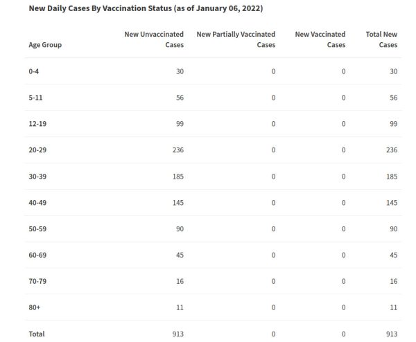
Apparently unconvinced by a screenshot, a couple of commentors have demanded I provide “a source”.
Okey Dokey.
Update: This is astonishing. I linked the source page above at 21:06:17 Eastern January 6th. This evening the page screenshotted above has been removed and replaced with charts that don’t mention vaccine status at all. You must download the database for yourself to find the vaccine status breakdowns (which for the past few days are patently ridiculous).
This is about the fourth time that the SaskHealth dashboard has been reconfigured immediately after posts appeared here reporting the vax vs unvax new case statistics – and that’s also patently ridiculous.
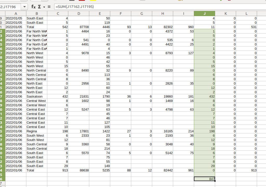
Morning Update, from betacamsp:
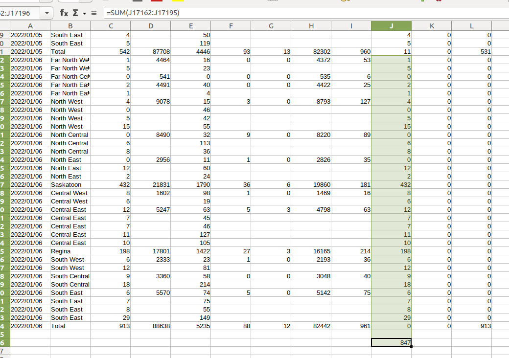
The Excel data, downloaded this Friday morning, indicates that 847 of 913 cases yesterday were in the vaccinated. I have no faith in the data but that sounds more in line with the neighboring provinces.
Exactly.
Errors happen. But errors shouldn’t be lingering for days on a government website, staffed by people whose job it is to ensure that information is accurate, or if it is in question, that the appropriate disclaimers are front and center.
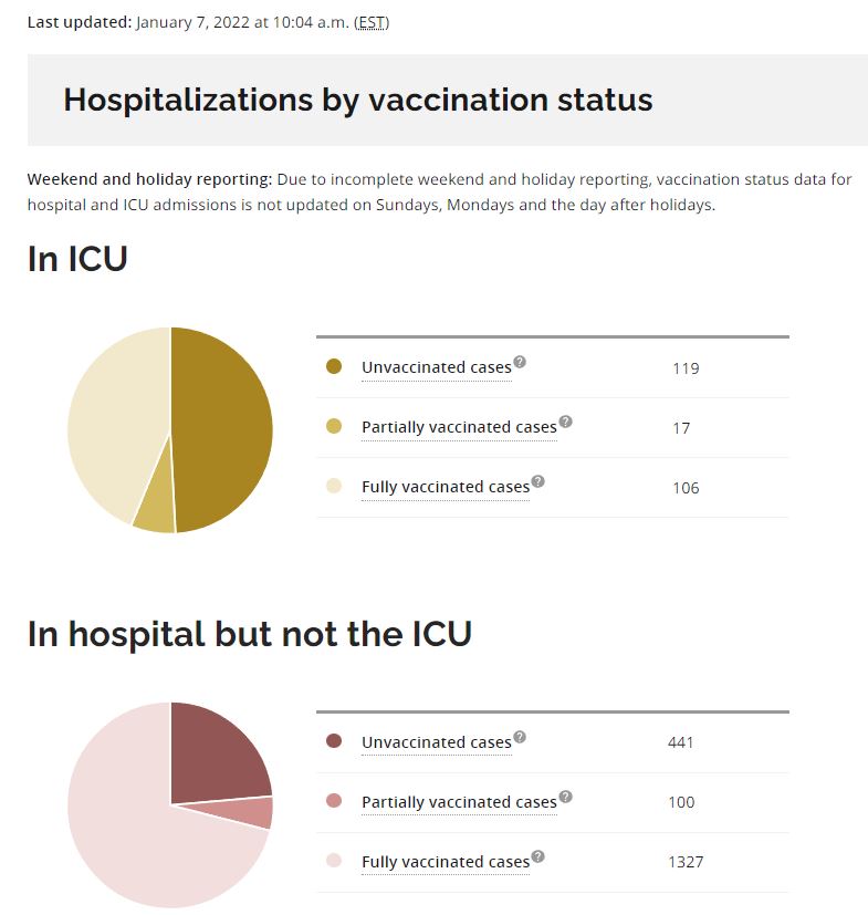
Yesterday John Gormley, God love him, actually reported to tens of thousands of Saskatchewan listeners — with a straight face — that 99% of new cases were in the unvaccinated, because the SaskHealth dashboard told him so. Words fail.
From the comments;
I just downloaded the CSV files and had a poke at them.
Garbage data. If I presented data and summaries like that to my clients I’d be fired, quickly for incompetence.
Like Nini I just did some basic checksums to see if things literally added up, and they don’t at all. They sure as shit don’t correspond to whatever that graph was presented yesterday for any of the previous dates either. Either the data they used for the graphs is not the same as the data from the spread sheet or I don’t know what. I literally cannot conceive of how they got the information in the graph from the information in the tables. They couldn’t even get a basic summation correct, January 6th it was fluffed up by 8%. spot checking a few other day’s summaries there are similar errors in not even being able to create a summary of just a few rows of data accurately. In fact some days show hundreds of new cases in the one total, 68 new cases in a different total for the same day and ZERO contributing cases for both those totals, so its either 480% over or it’s %cannot calculate% over or it’s all total bullshit made up to fit some kind of curve.
If this is spat out by a program, the programmer should be fired as should the project manager. This is literally grade four math stuff being able to add up 20 lines of 1-3 digit numbers accurately by hand much less using a computer.
I spend endless time telling my children they must be prepared to “Show their work” for their math and science. I’d fail them on the spot for this crap.
Jesus Christ on his Throne, this is fucking bonkers.
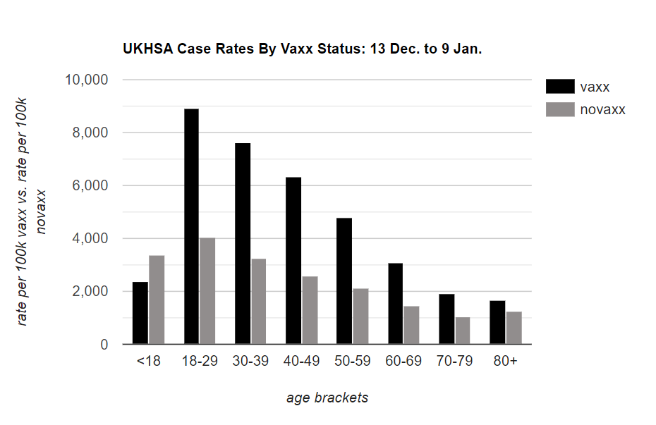
Click for full size.