Why this blog?
Until this moment I have been forced to listen while media and politicians alike have told me "what Canadians think". In all that time they never once asked.
This is just the voice of an ordinary Canadian yelling back at the radio -
"You don't speak for me."
email Kate
Goes to a private
mailserver in Europe.
I can't answer or use every tip, but all are appreciated!


Katewerk Art
Support SDA
Paypal:
Etransfers:
katewerk(at)sasktel.net
Not a registered charity.
I cannot issue tax receipts
Favourites/Resources
Instapundit
The Federalist
Powerline Blog
Babylon Bee
American Thinker
Legal Insurrection
Mark Steyn
American Greatness
Google Newspaper Archive
Pipeline Online
David Thompson
Podcasts
Steve Bannon's War Room
Scott Adams
Dark Horse
Michael Malice
Timcast
@Social
@Andy Ngo
@Cernovich
@Jack Posobeic
@IanMilesCheong
@AlinaChan
@YuriDeigin
@GlenGreenwald
@MattTaibbi
Support Our Advertisers

Sweetwater

Don't Run

Polar Bear Evolution

Email the Author
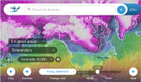
Wind Rain Temp
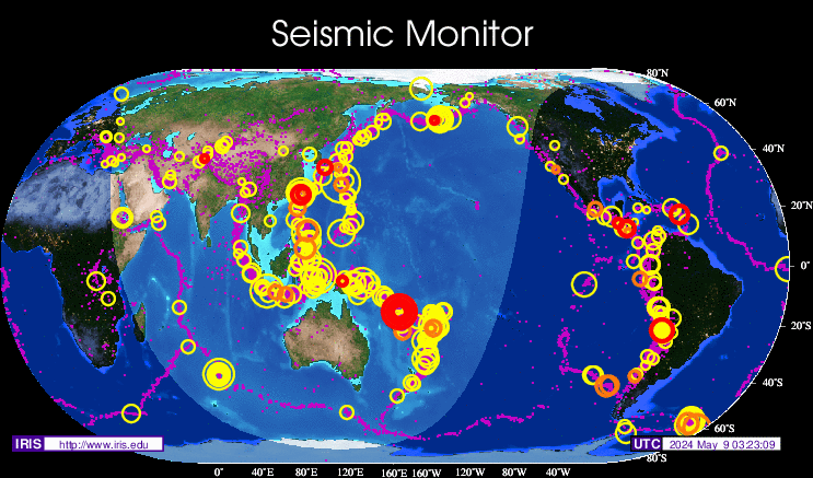
Seismic Map
What They Say About SDA
"Smalldeadanimals doesn't speak for the people of Saskatchewan" - Former Sask Premier Lorne Calvert
"I got so much traffic after your post my web host asked me to buy a larger traffic allowance." - Dr.Ross McKitrick
Holy hell, woman. When you send someone traffic, you send someone TRAFFIC.My hosting provider thought I was being DDoSed. - Sean McCormick
"The New York Times link to me yesterday [...] generated one-fifth of the traffic I normally get from a link from Small Dead Animals." - Kathy Shaidle
"You may be a nasty right winger, but you're not nasty all the time!" - Warren Kinsella
"Go back to collecting your welfare livelihood." - Michael E. Zilkowsky

Tweet is missing from front end of Blog post…
Never mind… just me, a refresh and bingo it was all there.
I sometimes wonder what Mark Twain woulda said about computer models…..he did have an opinion on statistics…….
Wotta brilliant guy —
// Natural forcings have dominated for 4.5B yr //
Why that picture of Ros Carter with John Gacy?
Oh Gacy was a LEFT-WING serial killer !!
It’s twitter alright.
The problem is that the LIVs and green goofs will look at that graph and say “See, temperature’s going UP!”
The climate modellers have failed, comprehensively. The important question for policy formation
is not, “is the Earth warming”,
but “can we predict temperatures and rainfall in the future?” The answer, clearly, is NO.
This relegates “climate science”
to the realm of birdwatching, as a science; or perhaps less than birdwatching (birds can be interesting).
“Oh Gacy was a LEFT-WING serial killer !!”
Yep, just like Jim Jones, another evil and twisted Democrat. Just like Fred Phelps, another evil and twisted Democrat.
I do not understand the graph ….. can someone please explain it for me ??
Thank you.
Arnie:
What is being plotted is the result of this caclulation:
Data point y value = (Model mean predicted temp anomaly) – (Actual measured HADCRUT4 temp anomaly)
Think of it as an error signal between the models and reality. The fact the error signal is always positive (except in 2002 it was zero) and growing means the models are diverging from reality as time goes on, and that the models always predict higher temps than reality. The red line is just a linear average, but it shows the models are diverging from reality at a rate that is about double the rate those models claim the earth is warming (they claim 1.2C/century but this error is growing at a nominal 2.33C/century. The model error is worse than the earth temp anomaly itself!
Ray