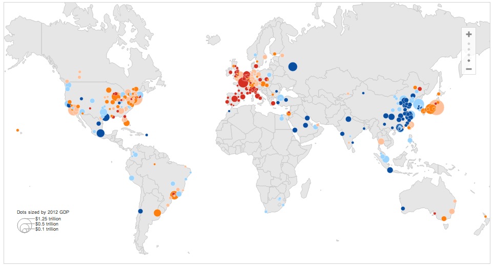
Two interesting infographics were published recently that make it so easy to see the decline of the West, even a caveman can do it.
…..read more HERE

Two interesting infographics were published recently that make it so easy to see the decline of the West, even a caveman can do it.
…..read more HERE
Folks, I just saw that Oklahoma City is one of the few who is ahead of the game and the ObamaCare is getting ready to kneecap the whole economy of Oklahoma. The largest employer if Hobby Lobby who I worked for at one time for ten years. I went to lunch with the owner at least three times each week and he is a man who is a strong Christian with very strong beliefs who along with his wife has passed them on to his grown children. They own a company which is debt free and did 3 billion dollars in sales last year and they employee 13,000 full time workers who are covered by insurance.
Hobby Lobby will never pay for the morning after pill and the U S government has now decided that their religious beliefs against abortion do not matter and they are getting ready to put Hobby Lobby out of business. This company is the largest private employer in the state of Oklahoma and their demise will not be good for a city that has gained reasonable recovery in hard times. What kind of world are we living in when a government will crash an employer to exert its will for one pill?
Thank about it as we swirl down the drain.
Maybe, OldTexan, we can kill two birds with one shot in the upcoming civil war.
I find it very interesting how well Mexico, Chile, and much of the rest of the LA is doing. I am pretty optimistic on that region. I wonder how long until they are complaining about American illegals getting into their country?
It’s odd that the 2nd set of data claimed Canadians are spending less than they take in given Canada’s massive credit bubble.
northeastern USA and Europeen decline is already in accelorated state, who’da thunk!!!!
And the answer to why 47 million US citizens are on food stamps can be found here.
http://english.people.com.cn/90778/8073522.html
Can’t shut down thousands of factories, kick millions of workers to the curb and then be surprised that the middle class tax engine broke down. Wonder if the vouchers for food stamps are made in China ?
The notion that outsourcing is the cause of America’s foodstamp surge is cro-magnon economics. To even call it that is to excessively elevate it.
Damn. Things don’t look good for Edmonton and Calgary. Must be our new “conservative” premier.
Interesting perspective. If you did not have a big recession you cannot there is no available recovery so you are under performing. I’ll take Calgary or Edmonton over Detriot any day.
Alberta provides a lot of transfer payments for Canada. It would get pretty interesting if it had a recession.
There is no mystery as to why Edmonton and Calgary are shaded orange.
Conventional crude from Alberta is selling around $60/barrel and heavier crude is fetching around $45/barrel. That is a huge discount from the Brent crude price and the WTI price.
It is going to get worse before it gets better. Having Alberta’s crude landlocked is a huge advantage for the US refiners. They are allowed to export the refined products, gasoline, diesel ect. because it does not fall under the export ban on domestic petroleum. Any surplus Canadian crude helps to subsidise American fuel prices.
Maybe now people will understand why there is so much money being funneled to the greenies to stop any pipeline to the West coast.
Now it all becomes clear, thank you!
Of course Mexico is doing well, they filled up their sweatshops then sent the extra deadbeats over the desert to flood US jails, food banks, and hospitals.
the extra deadbeats over the desert to flood US jails, food banks, and hospitals.
Lies.
LAS >
Ha ha , Everyone knows it’s true including you.
That’s why the Mexican government is a fully active lobby in US political affaires from the state to federal levels.
They dump their excess garbage on US soil and expect returns as any mafia organization would.
Rob, thanks for scale the Infographics
Uhhh…… this map ranks Cairo much higher than Tel-Aviv.
Really?
A third-world nation that’s destroyed its tourism-based economy by electing radical Muslims – and is plunging into even deeper violence, isolation, poverty and illiteracy?
And it ranks better than a city brimming with hi-tech start-ups and an educated populace – in a country poised to make profit on recent natural gas finds?
Take this data with a VERY LARGE grain of salt.
Problem with this map – it’s ranking RATE OF GROWTH. There is a simple mathematical formula which will set everyone’s mind at ease, or should at least mitigate the fear a chart like this is trying to spread.
GDP of a city = 1000 (New York, say) and grows to 1,100 over 3 years. That’s roughly 3% a year.
GDP of city 2 = 100 (Cairo, let’s say) and grows to 200 over 3 years. That’s roughly 33% a year.
So Cairo looks “stronger” than New York, when in fact it is not. It’s not even close. This is the paradox of very small numbers. We fear the guy whose income grew 100% last year. What nobody tells you is that guy only went from earning $100 to $200 a year. Meanwhile, your income grew “only” 3%. But your $100,000 salary is now $103,000. You gained considerably more than that other guy did!
Fear this nonsense? Decline of the West? The decline isn’t economic in nature. It’s shown in the decline of intelligent analysis and cognitive reasoning.
I’m sorry for all you who think I’m a fly in the ointment, but truth is truth. China is “growing” because of slave labor in their gulags. As we know from our own history with the South, slave economies have limitations on growth, and China is starting to run into those limitations.
These “maps” are pure and utter nonsense.
The REAL problem we face is a government which is scared of silliness like this and feels a “top down” approach to economic management will “solve” the problem. It won’t. It will exacerbate the issue and make this a self-fulfilling prophecy.