Why this blog?
Until this moment I have been forced to listen while media and politicians alike have told me "what Canadians think". In all that time they never once asked.
This is just the voice of an ordinary Canadian yelling back at the radio -
"You don't speak for me."
email Kate
Goes to a private
mailserver in Europe.
I can't answer or use every tip, but all are appreciated!


Katewerk Art
Support SDA
Paypal:
Etransfers:
katewerk(at)sasktel.net
Not a registered charity.
I cannot issue tax receipts
Favourites/Resources
Instapundit
The Federalist
Powerline Blog
Babylon Bee
American Thinker
Legal Insurrection
Mark Steyn
American Greatness
Google Newspaper Archive
Pipeline Online
David Thompson
Podcasts
Steve Bannon's War Room
Scott Adams
Dark Horse
Michael Malice
Timcast
@Social
@Andy Ngo
@Cernovich
@Jack Posobeic
@IanMilesCheong
@AlinaChan
@YuriDeigin
@GlenGreenwald
@MattTaibbi
Support Our Advertisers

Sweetwater

Don't Run

Polar Bear Evolution

Email the Author
Wind Rain Temp
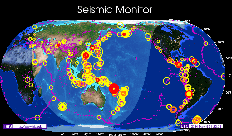
Seismic Map
What They Say About SDA
"Smalldeadanimals doesn't speak for the people of Saskatchewan" - Former Sask Premier Lorne Calvert
"I got so much traffic after your post my web host asked me to buy a larger traffic allowance." - Dr.Ross McKitrick
Holy hell, woman. When you send someone traffic, you send someone TRAFFIC.My hosting provider thought I was being DDoSed. - Sean McCormick
"The New York Times link to me yesterday [...] generated one-fifth of the traffic I normally get from a link from Small Dead Animals." - Kathy Shaidle
"You may be a nasty right winger, but you're not nasty all the time!" - Warren Kinsella
"Go back to collecting your welfare livelihood." - Michael E. Zilkowsky

The AGW alarmists are closet Peak Oil deniers.
ABC news still blaming Obama’s woes on global warming
http://abcnews.go.com/print?id=8786346
“The Taliban” and “global warming” may not seem to belong in the same sentence.”
Apparently drought is the leading cause of gun and IED play.
This is a fairly astounding article, especially from the “Climate Correspondent” of the Beeb. The final sentence in the article:
One thing is for sure. It seems the debate about what is causing global warming is far from over. Indeed some would say it is hotting up.
Perhaps the naked emperor is finally being called out.
They even offer a ‘let’s see how good your prophecies are’ statement.
Two years between 2010 and 2015 will be hotter than 1998.
Buying more time.
Based on the oceanic cooling evidence though, the gong will be banged again on the AGW Gong Show.
Um, not to appear stupid, but could someone explain to me how the “average” temperature on that graph is below the “actual” temperature at every point on the chart? I’ve only taken a couple of advanced courses on statistics, so perhaps I have more to learn.
Or maybe they took these temperatures at Lake Woebegon.
KevinB
I think it is the long term average, not the average of 1998-2008
“Um, not to appear stupid, but could someone explain to me how the “average” temperature on that graph is below the “actual” temperature at every point on the chart? I’ve only taken a couple of advanced courses on statistics, so perhaps I have more to learn.
Or maybe they took these temperatures at Lake Woebegon.
Posted by: KevinB at October 10, 2009 3:47 PM ”
Had me wondering about that too,Kevin. Maybe the “actual” at Death Valley and the “average” at Mt.Everest??
Some things in life are to precious to miss. The laugher of Children at play. The sweet air of an early morning. The first sip of coffee. Maybe just the holding of your lover. One of the nicest though is to wake up to TV. Watching a Global warming panels in the middle of blizzards in the late fall or spring.
Heh, reminds me of that old SnL sketch, with Mike Myers playing Linda Richman, hostess of Coffee Talk. Picture a robust, sixty-something woman with a heavy New Yawk accent.
When she’d start to get emotional (which invariably happened over the littlest thing), she’d rattle off a random two word phrase as follows:
LR: I’m getting verklempt! Talk amongst yourselves. I’ll give you a topic. Global warming is neither global, nor warming. Discuss…
this is the article that I posted about earlier, in that thread about puppies being offed:-))))
kevin
I’ma statisic stupid, but that black line would be a “base” average, and when the red one starts to dip below the black one to often and to far, we can go shoot gorebull, mann, hansen, and a few more of those lying SOB’s
KevinB – good question about that green line. It is labeled “Trend” so I’m guessing it is meant to show the slope of the averaged data, and they moved it out of the way of the actual data line for presentation purposes. It obviously does not show the actual magnitude of the trend line on the Y axis scale. It is needlessly confusing.
Kevin B,
Which advanced courses in statistics did you take?
The graph is indicating the trend. A trend is not the same thing as an average. The trend is actually quite apparent just looking at the data.
The arrow indicating the slope of the trend has been placed below the data, probably to make the graph look more attractive.
Like most useful things, interpretation of statistics require a bit of common sense.
I’m pretty sure Kevin took the same stats courses I took – namely, the ones that teach you how to read a graph. The black line, not the green one, is clearly labelled “Average Temperature”, and it is just as clearly universally less than every value on the data set labelled “Actual Temperature”. Which is mathematically impossible. So the “Average Temperature” data set is clearly not the the arithmetic mean of the “Actual Temperature” data set. In addition, I can’t track down the original source of the graph; if c3 plotted it themselves from NOAA source data, they’ve done a really sloppy job of it.
If you can cherry pick your data one way, you can cherry pick it another. It matters not one whit where the ‘average’ lies, that eleven year trend is goin down.
Thank you, Daniel. Nice to know someone else recognizes shoddy work when they see it.
Mike Blackadder: “Like most useful things, interpretation of statistics require a bit of common sense.”
Really? Tell me how your common sense works with these:
http://www.ted.com/talks/lang/eng/peter_donnelly_shows_how_stats_fool_juries.html
http://en.wikipedia.org/wiki/Monty_Hall_problem
Although I do not doubt the data, it’s true the style of the graph is a little less than scientific.
The header also contains a typo, and should read -0.73, not -7.3
Although I do not doubt the data, it’s true the style of the graph is a little less than scientific.
The header also contains a typo, and should read -0.73, not -7.3
Posted by: clear at October 11, 2009 12:53 PM
Actually, the header is correct, in that it says -7.3% per CENTURY, extrapolating the 10-year data out over a 100-year period (i.e. multiplied by 10).