Why this blog?
Until this moment I have been forced to listen while media and politicians alike have told me "what Canadians think". In all that time they never once asked.
This is just the voice of an ordinary Canadian yelling back at the radio -
"You don't speak for me."
email Kate
Goes to a private
mailserver in Europe.
I can't answer or use every tip, but all are appreciated!


Katewerk Art
Support SDA
Paypal:
Etransfers:
katewerk(at)sasktel.net
Not a registered charity.
I cannot issue tax receipts
Favourites/Resources
Instapundit
The Federalist
Powerline Blog
Babylon Bee
American Thinker
Legal Insurrection
Mark Steyn
American Greatness
Google Newspaper Archive
Pipeline Online
David Thompson
Podcasts
Steve Bannon's War Room
Scott Adams
Dark Horse
Michael Malice
Timcast
@Social
@Andy Ngo
@Cernovich
@Jack Posobeic
@IanMilesCheong
@AlinaChan
@YuriDeigin
@GlenGreenwald
@MattTaibbi
Support Our Advertisers

Sweetwater

Don't Run

Polar Bear Evolution

Email the Author
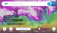
Wind Rain Temp
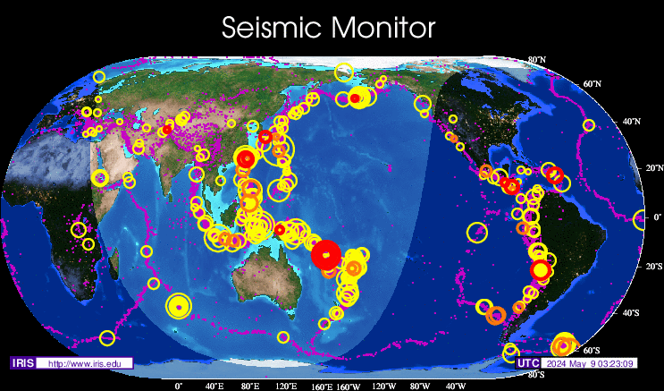
Seismic Map
What They Say About SDA
"Smalldeadanimals doesn't speak for the people of Saskatchewan" - Former Sask Premier Lorne Calvert
"I got so much traffic after your post my web host asked me to buy a larger traffic allowance." - Dr.Ross McKitrick
Holy hell, woman. When you send someone traffic, you send someone TRAFFIC.My hosting provider thought I was being DDoSed. - Sean McCormick
"The New York Times link to me yesterday [...] generated one-fifth of the traffic I normally get from a link from Small Dead Animals." - Kathy Shaidle
"You may be a nasty right winger, but you're not nasty all the time!" - Warren Kinsella
"Go back to collecting your welfare livelihood." - Michael E. Zilkowsky


Is that a bar graph or the heart beat monitor showing the heart rate of Monty Python’s parrot?
Of course Trudeau, Wynne and Notley are the shop keepers insisting the parrot is alive while people not under the thrall of the progressive agenda are the ones seeking a refund for the dead parrot they have been sold.
glad I use my 72″ screen indian TV with my computer, so’s I can see the variance:-)))
How DARE the graph-maker NOT use an exaggerated-scale y-axis !! Of course this graph looks tame ! You HAVE to blow-up the y-axis ! Haven’t you learned anything from all the BRIGHT RED weather maps ? By coloring 80deg. F. temps in BRIGHT RED … you can easily convince a dull-witted public just how BLAZING HOT the earth has become (because of all those hicks who drive pick-up trucks).
This graph is very interesting and I want to track its provenance and examine the methodology used so I know exactly what it is showing (and what I would be talking about). The URL displayed leads nowhere (even when entered manually). Could you please provide some working links to the source. Thank you much.
Neil….it’s global temps plotted on the scale of a thermometer….
Here’s the original.. https://suyts.wordpress.com/2014/05/27/how-global-warming-looks-on-your-thermometer/
Run, everyone! Run! It’s just like a hockey stick.
Sort of. Kinda.
Thank you!
Needs more cowbell.
Canada: Irrelevant?
https://twitter.com/luisbaram/status/843315896240291840
oh no no no no no Hank, we Canuckistanis must, MUST atone for out unacceptable per capita emissions:
http://www.ucsusa.org/global_warming/science_and_impacts/science/each-countrys-share-of-co2.html#.WM8RbmczXoo
16 tonnes, TONNES that is, in 2011, mainly because we are a COLD country half the year, but matters not a whit to the suzukis and wynndefarms of the domain . . . . .
Neil, I’m not sure you’re typing in the URL properly. Try clicking on this … http://data.giss.nasa.gov/gistemp/tabledata_v3/GLB.Ts+dSST.txt
Anyway, it takes me to GISS’ annual and monthly temp anomaly page. It’s pretty straight forward. GISS uses a base period, 1951-1980, to declare what they believe the average global temp should be. It was 14 deg C, or 57.2 deg F, according to GISS. So, then, all one does is take their anomalies, which are in Celsius, and multiply by 1.8 to get it in F. Add those numbers to the 57.2 and there’s the stated global average temperature.
Cheers,
James
Scarier, and closer to the consensus if you tip the right side of the monitor way up.
Clearly the graph just proves that 99% of scientists agree that math is racist.
Clearly the graph simply proves that 99% of scientists agree that math is racist.
do my emissions count when I am not in Canada? I spend a lot of time in Florida and judging from the volume of Ontario plates seen here many people are not emitting anything in Canada.
“…many people are not emitting anything in Canada.”
Yeah. Snowbirds usually don’t. Thow Palm Springs in there as well.
Heh.
Ahh. Thank you. Missed the underscore.
Your explanation reveals all but to ensure I am doing this right pls check me out as follows:
– The base period 1951 – 1980 is used to calculate an average annualized (ideal??) earth temperature of 57.2 degrees F;
– The data set is derived by first measuring (somehow) global temperatures for each month for each year;
– Next, the amount by which each month’s temperature differs from 57.2 is calculated;
– For 2016, the mean temperature anomaly for January was 113 or (113 / 100) x 1.8 = 2.034 degrees F;
– Next, the monthly anomalies are annualized yielding .98 degrees C as taken from the Jan – Dec AnnMean column;
– .98 degrees C x 1.8 becomes 1.764 degrees F for 2016;
– 1.764 degrees F + 57.2 degrees F = 58.964 degrees F which is the global average temperature for 2016; and,
– You plot 58.964 on your chart.
Conclusion: eyeballing the temperature anomalies for the entire period (1880 – 2017), there is a definite warming trend but when the scale is represented accurately as you do in your (rather ingenious) Alcohol Thermometer display, the anomalies are shown to be immaterial. Simply put, use an absolute not a relative scale to display what is happening to temperature.
Did I get it?