Why this blog?
Until this moment I have been forced to listen while media and politicians alike have told me "what Canadians think". In all that time they never once asked.
This is just the voice of an ordinary Canadian yelling back at the radio -
"You don't speak for me."
email Kate
Goes to a private
mailserver in Europe.
I can't answer or use every tip, but all are appreciated!

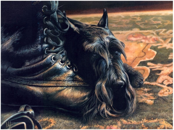
Katewerk Art
Support SDA
Paypal:
Etransfers:
katewerk(at)sasktel.net
Not a registered charity.
I cannot issue tax receipts
Favourites/Resources
Instapundit
The Federalist
Powerline Blog
Babylon Bee
American Thinker
Legal Insurrection
Mark Steyn
American Greatness
Google Newspaper Archive
Pipeline Online
David Thompson
Podcasts
Steve Bannon's War Room
Scott Adams
Dark Horse
Michael Malice
Timcast
@Social
@Andy Ngo
@Cernovich
@Jack Posobeic
@IanMilesCheong
@AlinaChan
@YuriDeigin
@GlenGreenwald
@MattTaibbi
Support Our Advertisers

Sweetwater

Don't Run

Polar Bear Evolution

Email the Author
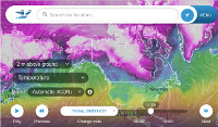
Wind Rain Temp
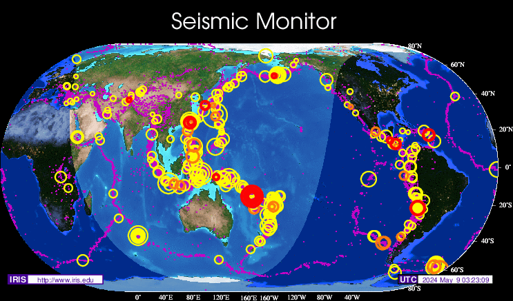
Seismic Map
What They Say About SDA
"Smalldeadanimals doesn't speak for the people of Saskatchewan" - Former Sask Premier Lorne Calvert
"I got so much traffic after your post my web host asked me to buy a larger traffic allowance." - Dr.Ross McKitrick
Holy hell, woman. When you send someone traffic, you send someone TRAFFIC.My hosting provider thought I was being DDoSed. - Sean McCormick
"The New York Times link to me yesterday [...] generated one-fifth of the traffic I normally get from a link from Small Dead Animals." - Kathy Shaidle
"You may be a nasty right winger, but you're not nasty all the time!" - Warren Kinsella
"Go back to collecting your welfare livelihood." - Michael E. Zilkowsky

You can’t have a climate change narrative when data constantly contradicts the propaganda. It is difficult to lie in the face of the facts. So communists just remove the facts so that they don’t have to work as hard.
Well, ghost voters need concerns too!
So Roger coppock may be unME’ s real name?
My Great Grandfather and my Grandfather maintained a station in Oregon from the late 20’s to the 80’s. My father has the log books from the entire run of readings. In 2008 he compared the online history with their original readings. He found that the “hot” readings from the late 30’s were adjusted down and the cooler readings from 70’s were adjusted up. You can’t trust any off their historical numbers as they have applied algorithms to the data to fit their “the world is hotter than ever” story line.
It’s also how Democrats count the votes. By algorithms. The only way to win is: “Too BIG to RIG”.
The only way to kill off the FRAUD of global warming: “Too COLD for the SCOLDs”.
even the weather must submit to the gods of grift
Climate change reality chek – worth repeating:
What is the actual relationship between CO₂ emissions and temperature? For the sake of this discussion let’s assume the IPCC has it right. According to the IPCC’s latest comprehensive report (“AR6”) – See Page 19: “For every 1000 Gt CO₂ emitted by human activity, global surface temperature rises by 0.45°C (best estimate, with a likely range from 0.27°C to 0.63°C).”
https://www.ipcc.ch/report/ar6/syr/downloads/report/IPCC_AR6_SYR_SPM.pdf
Translated to more commonly used metrics, this is a very broad “likely” range of 0.00000027°C to 0.00000063°C physical temperature impact per megatonne (Mt) CO₂ emitted. (The science seems pretty unsettled!) Canada’s emissions in 2023 were 694 Mt. Using IPCC’s “best estimate” of 0.00000045°C/Mt, Canada’s TOTAL impact on global warming is a matter of simple arithmetic:
0.00000045°C/Mt x 694 Mt/yr = 0.0003123°C/yr.
This is equivalent to 1°C in 3202 years.
It’s not surprising that activists measure ‘success’ in terms of tonnes of emissions – a meaningless metric to most people.
Same in jolly old England, where it’s been proven the ghost station location is in the ocean just off the beach.
Take paradise, and put up a parking lot.
Then claim the paved world represents global reality.
All my favorite places
My city had been pulled down
Reduced to parking spaces
Ay, oh, way to go, Ohio
https://youtu.be/IcQL2824DPc?si=w1eghovgUfQwfXR6
Meanwhile, the exploding population of CA (see: Sanctuary State) has created a critical parking shortage in my little slice of suburban bliss. Most of the day I cannot go to CVS pharmacy, because there are literally NO parking places for blocks, and drivers clog the aisles waiting for someone to leave. Complete and utter gridlock … in my little town
I’ve lived here more or less continuously since 1965. I never thought it would EVER devolve to this level of shittiness … but it has. The reasons are myriad … and not solvable in my remaining lifetime … so I’m DONE. I’m fleeing to the wide open country, where trees, sun, and soil gridlock the land.
Also I like the ‘meaningless metric’.
A mixed bag of power politics and greed.. A anti capitalist theory that appealed to both communists and greens was adopted by the wider liberal movement to expand their control over everything.. None of it able to deliver a superior product or service.. Then its zero carbon, ban the competition time because outside the vested interests, nobody wanted or needed it..
Of all things.. A top down communist revolution where the entire upper class become the PARTY.. Who needs peasants to take power when they already have it.. A more accurate description would be a COUP.. Coups are top down affairs.. Revolutions bottom up..
I hear the commissar is offering free caulking around a window if I euthanize a loved one.. Fun stuff..
Love the commissar.
If a station has a particular pattern over the years and stations in areas surrounding have the same
pattern [even if temperatures on a particular day are not the same] then the one station can
stand for the others.
A study of the entire earth for this was done decades ago
// We analyze surface air temperature data from available meteorological stations with principal focus on
the period 1880-1985.
The temperature changes at mid-and high latitude stations separated by less than
1000 km are shown to be highly correlated;
at low latitudes the correlation falls off more rapidly with distance for nearby stations.
We combine the station data in a way which is designed to provide accurate long-term variations. //
Global Trends of Measured Surface Air Temperature
JOURNAL OF GEOPHYSICAL RESEARCH, VOL. 92, NO. Dll, PAGES 13,345-13,372, NOVEMBER 20, 1987
“If a station has a particular pattern over the years and stations in areas surrounding have the same
pattern [even if temperatures on a particular day are not the same] then the one station can
stand for the others.”
Translation: you believe them, even though they have already been exposed as liars who deliberately manipulated the data to suit their needs. Does that make you a liar as well, or just gullible?
It makes him a repeater of lies. An accomplice to the liars. And as guilty as they are, because he doesn’t think critically and check the many available resources that dispute the narrative and have actual proof.
From Tony Heller. 777 Imaginary Thermometers.
https://youtu.be/AIgfzAgYDjE?si=mx0eSBquPHm2mAp5
Climate arithmetic.
Multiply very small numbers by very big numbers, and adjust the least significant digits until you get the result you want.
In the early years of the Obama Admin. is when I first saw the photos of climate monitoring stations set up far too close to air conditioning venting, there isn’t a great difference between that and making it all up.
This reader finds Dr. Roy Spencer’s global temperature measurements credible. Since 1979, we have had the ability to measure temperatures by satellite. The results show a highly irregular pattern of warming at an average rate of 1.5 degrees C per century.
Natural variation is clearly the main cause – the pattern of warming looks nothing like steadily increasing CO2 levels.
https://www.drroyspencer.com/latest-global-temperatures/
Just for S&G’s, I’d like to see Dr Spencer plot said increasing CO2 levels on his UAH graphs.
Agreed. For those who care to look, CO2 levels are here. Very predictable, unlike temperatures.
https://en.wikipedia.org/wiki/Keeling_Curve